The Food Park.
The Food Park. In 2016, I was approached by a former coworker who was venturing into a new project called Lote23, a food park for an up-and-coming neighborhood.
I was tasked with creating the logo, identity, and overall user experience for the Lote23 brand. Through the use of imagery, color, tone, and voice, we were able to achieve a “non hipstersk-hipster feel” for the brand.

Primary Logotype
The Lote23 logo design was a long process that entailed numerous revisions. It underwent so many tweaks and variations, I’ve lost count. Sadly, the computer that stored all of those samples was stolen, but I was able to save the original.
It is a custom handwritten typeface: not too busy, not too elaborate, almost a scribble. Although it is “loose,” the lines are very clean. No shakiness, no double lines. One single, steady pass, giving it a very pleasing appearance.
Creating a balance that will appeal to millennials and young professionals alike. As I like to explain it, “Not too rigid or corporate, as if it were for an audience like mom and dad, but not so loose that it makes me feel out of control.”


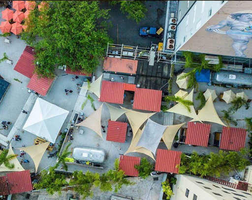
Creating the Space.
Since the beginning of Lote23, we knew that street art had to be present in Lote23. The idea behind it was bringing in different artists from different parts of the island to contribute to the cause. An artistic mecca in all aspects.
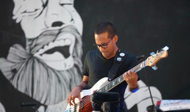
As Creative Director, I brought together a selection of artists and had a mural of my design painted by the main stage. My favorite salsa singer, Santurce-born, Ismael “Maelo” Rivera.