Budgettude
In 2018, I took on the General Assembly User Experience Design Circuit to get a little bit more of a feel for the processes of creating and curating a user experience. Although I’ve been dealing with user interfaces for a decent amount of time, I hadn’t really figured why certain design patterns were used and what techniques were used to determine which worked best for which user.
In said course we were tasked with the problem. The one I was assigned involved building a solution to help find airplane ticket deals. I created Budgettude, a flight travel app that worked for your established travel budget.
Context.
Millennials are more interested in experiences or events, rather than planning for the future. According to CNN, 66.5% of millennials don’t have any savings due to our crippling economy. But there is still the need for experiences, especially in travel.
According to an interview by Jeff Fromm (Forbes), millennials have a dire need to immerse themselves in different cultures and see themselves as citizens of the world, for which they give more weight to traveling over big weddings, starting families etc (Jeff Fromm, Forbes 2018.) With this information, I could draft the problem a bit better: What do millennials need to travel more?
Where to? Wherever.
Building something for a potential 73 million client base is ambitious to say the least. But I knew that there was “something” worth defining. For the purposes of the course, I interviewed several millennials and led a focus group around the topic of travel in order to build 2 personas, I used affinity mapping to group the similarities in the interviews to draw out patterns, and formalized my findings in these two “people.”
After gaining a better understanding of the audience’s needs (and what they believed what the solution could be) I traced out the most important things needed to have a satisfactory experience divided into three goals:
1. Visually appealing to millennials
2. Simple learning curve
3. Practical use

Solution(?)
IIn the beginning, we proposed different features and designed a competitive analysis with other companies to see if the product would differentiate itself from other products. After the interviews, I was referred to the course mentor in order to discuss my findings and what I proposed as a solution: bundled packages revolving around a complete travel experience: flight, accomodation, and experience (tours etc.)
My mentor basically destroyed the solution, saying: You can’t physically control these variables and ensure a quality experience due to the complexity of the parts involved, unless it is a sole provider, and even then it could be problematic. He proceeded to ask, “What can you offer the user that they don’t already have?” In an instant, a light bulb went off, and I answered: “the information regarding travel.” I went back to the drawing board and devised Budgettude.
An app that will mold itself to the users’ budget. As an added feature, past, present, and future flight offers would be displayed to help the user understand what the previous and future data looks like.

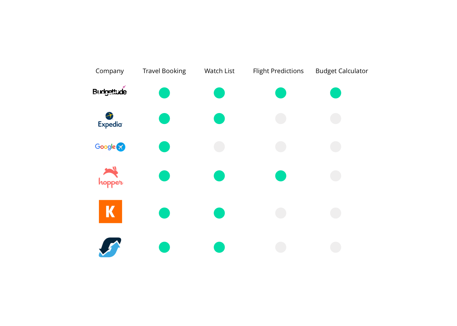
Competitive Study
Naturally, building a solution for traveling when there are so many players in the game, we had to try to understand what had already been built. Understand how our solution differentiated itself from the rest and how we were going to provide a valuable experience to the users.

Constrains
As this is a project for a class, my only constraint was time. While working full-time, 8- to10-hour days take a toll on the body and mind, and going to class afterwards was immensely draining. Not having the time to properly develop something is a real bitch. In the interest of this being a “real” product –because it had such a huge client base and we didn’t have a budget to develop the app– the user personas were built on a very small population of interviews.
Although it has been proven that a small population with the correct leading discussion can produce an efficient UX base model that future users can/will use.
The process.
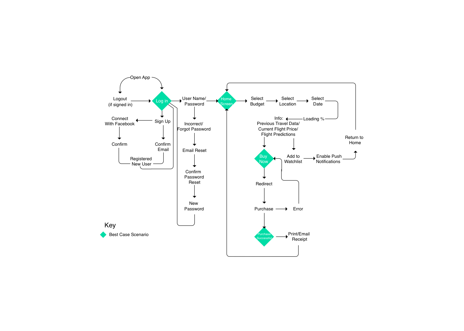
After a debriefing of the personas built for the project, my role was a bit more defined. I drew Initial sketches and determined user flow.
Prototypes
A lo-fi prototype (paper model) was built and tested on a pool of users in order to validate the design choices/user flow before proceeding to a more complex line of design (which would take a bit more of time to develop considering I was the sole designer in the project).

Low-fidelity prototype. Early September, 2018.

What we found.
Users were at times confused by the phrasing of certain things. Things like “Gotta Catch That Flight!” ( a vocabulary designed to match the company brand) seemed confusing. A new, simpler brand identity was added into the revision pile in order to address the findings.
Note: Since this was a course project, recommendations were documented, and only some were implemented due to time constraints.
User Testing

Six (6) out of ten (10) users were interested in the product. A traveling app that adjusts to a users budget, not the other way around.

Three (3) out of ten (10) found the “Past options” feature useless. Considering it illogical, since “the past already happened.”. Elder millennials enjoyed the option of viewing past offers.

Seven (7) out of ten (10) users would download the app if it was a real product, considering it showed a real opportunity for those who wanted to travel. The remaining three suggested that it was a bit too similar to Hopper and would not download it.
Users would download the app.
Designing the UI.
Since this was pretty much up to my creative flow, I chose to go for something millennials have responded to in the past: colorful gradients. It’s a very minimalistic approach to the project, but efficient nonetheless.
Gradient flows from yellow, to purple, to dark blue, and then back to yellow, simulating the experience of a sunset, twilight, night, and sunrise again.
At the time of the design, I owned a Samsung Galaxy S8, so this is designed for said device (made testing a lot easier.)

App Mockup. Late September, 2018.

Reflections.
Being the only designer can be a very fun experience, especially if a project was designed from scratch.
This was definitely a great learning experience that not only took me through the whole process but also helped me clarify some questions I had, all while learning the correct terminology. However, deadlines can become stressful when there is so much work to be done by one designer. Some user feedback was frustrating and at times contradicting.
