Roberto Clemente.
Baseball has always been important to Puerto Ricans. So much so, that Puerto Rico has a very prestigious school dedicated to teaching the sport. It has molded some of the best baseball stars in the whole league, including some hall of famers. And it all started with Roberto Clemente, one of the most (if not the most) recognized baseball players by Puerto Ricans.
Although his fame came from playing for the Pittsburgh Pirates, Clemente began his career on the island with the Cangrejeros de Santurce. He was an All-Star for 12 seasons, 12-time Golden Glove winner, World Series MVP, and was Inducted into the hall of fame in 1973, after playing for 18 seasons sporting the number "21". He died in 1972, at 38 years old, in a plane crash while he was on his way to help the people of Nicaragua after an earthquake. Ever since I became a designer, I’ve been doing Clemente-related art. Here are some of my favorites.
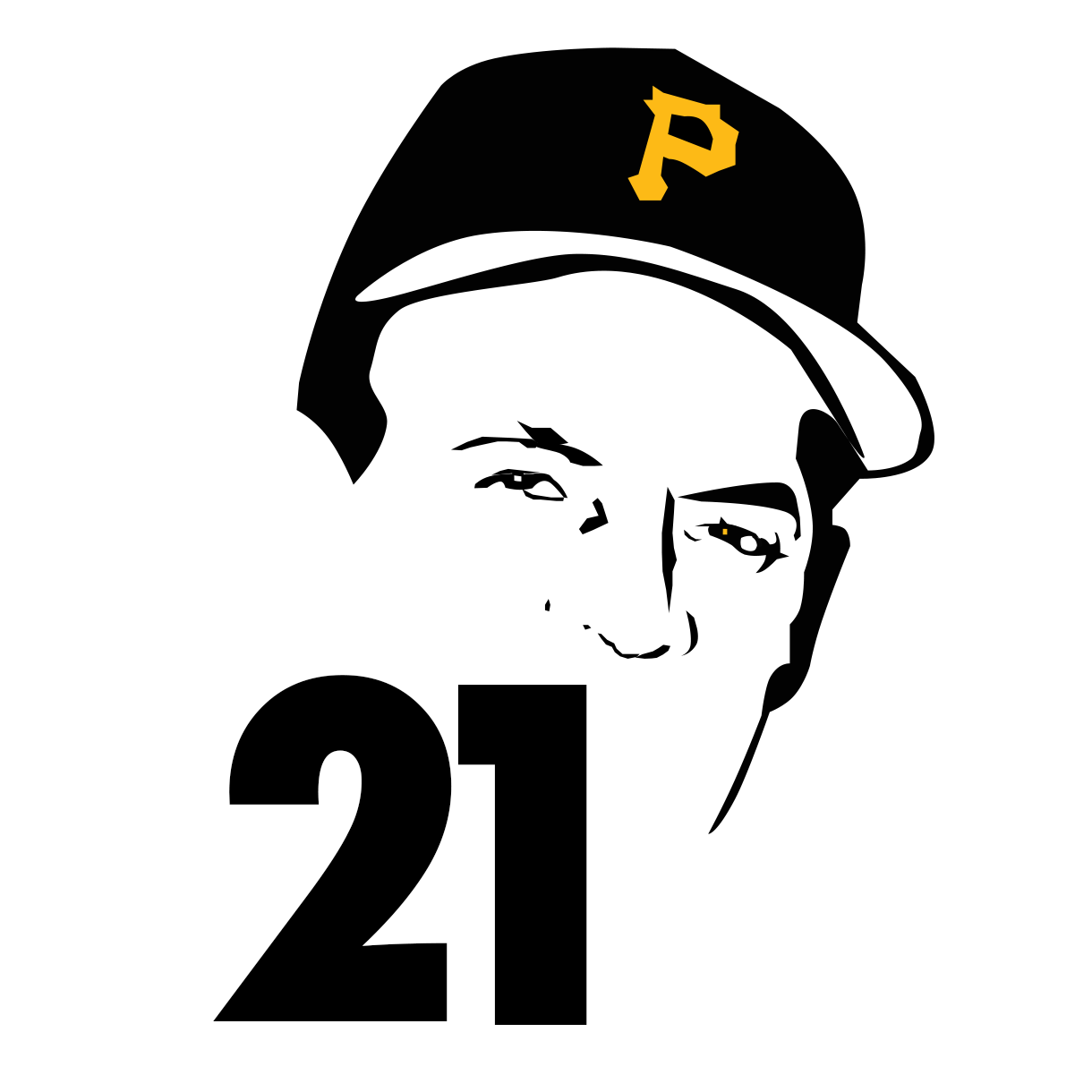
“21”. 2011
Back in 2011, I was still “trying out” design tools in college. This was a hobby at the time. It was very gratifying to get to a stage where I was drawing on a touchpad. In retrospect, I see that it needs some refining, but at the time, it got the point across: Anyone who knows Clemente, would recognize him, or at least identify him given the Pirates cap and the number 21. The yellow highlight against the black really screams “look at me.” Designing back then was so simple. I wasn’t interested in perfection, just focused on getting it done.

“Clemente”. 2013
In 2013, I was in law school and didn’t have a lot of time for drawing stuff. Although it was a stress reliever, I felt like I had “outgrown” my design phase, until I noticed that most of my notes had scribbles, doodles, or some form of design on it. And so, with a mountain of case briefs waiting to be read, I decided to pick up my tablet and just draw. I hadn’t drawn in a while, so I opted to design something that made me feel confident and safe: Clemente. Little did I know that this was to be a part of my transition from being a law student to a full-time designer.

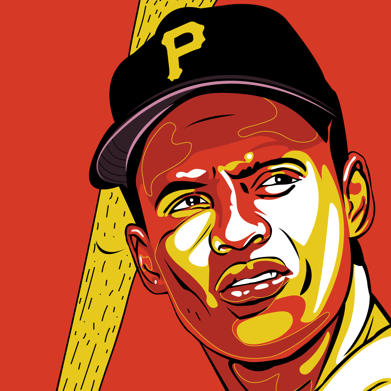
“Roberto Clemente”, for El Cartel de Santurce Expo, 2017
By 2017, I was a full-time designer for Parallel18, working on very technical designs. I needed a break from pushing pixels, and one of my mentors, Gerardo Cloquell, was hosting an art show highlighting Santurce. Immediately, I knew what I would be doing. There are a couple of key figures that resonate with Santurce; Roberto Clemente is one of them. Playing for the Cangrejeros de Santurce, catapulted Clemente to the MLB. It all started in Santurce for Clemente, therefore, my poster had to be about Clemente.
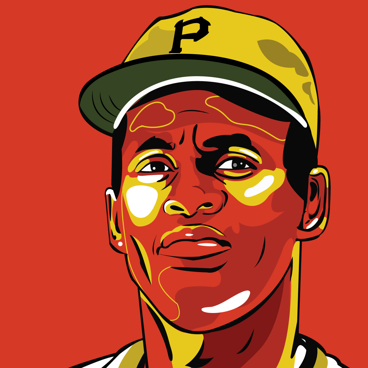
“21”, 2018.
As someone who’s color blind, I’ve always been attracted to the color red. It’s almost as if I gravitate towards it. In 2018, I saw an artist called Jor and was fascinated by his use of red. I entered my “Red” phase. I was more confident and clear with what I was doing in my work. “21” became an important transition period for my work.
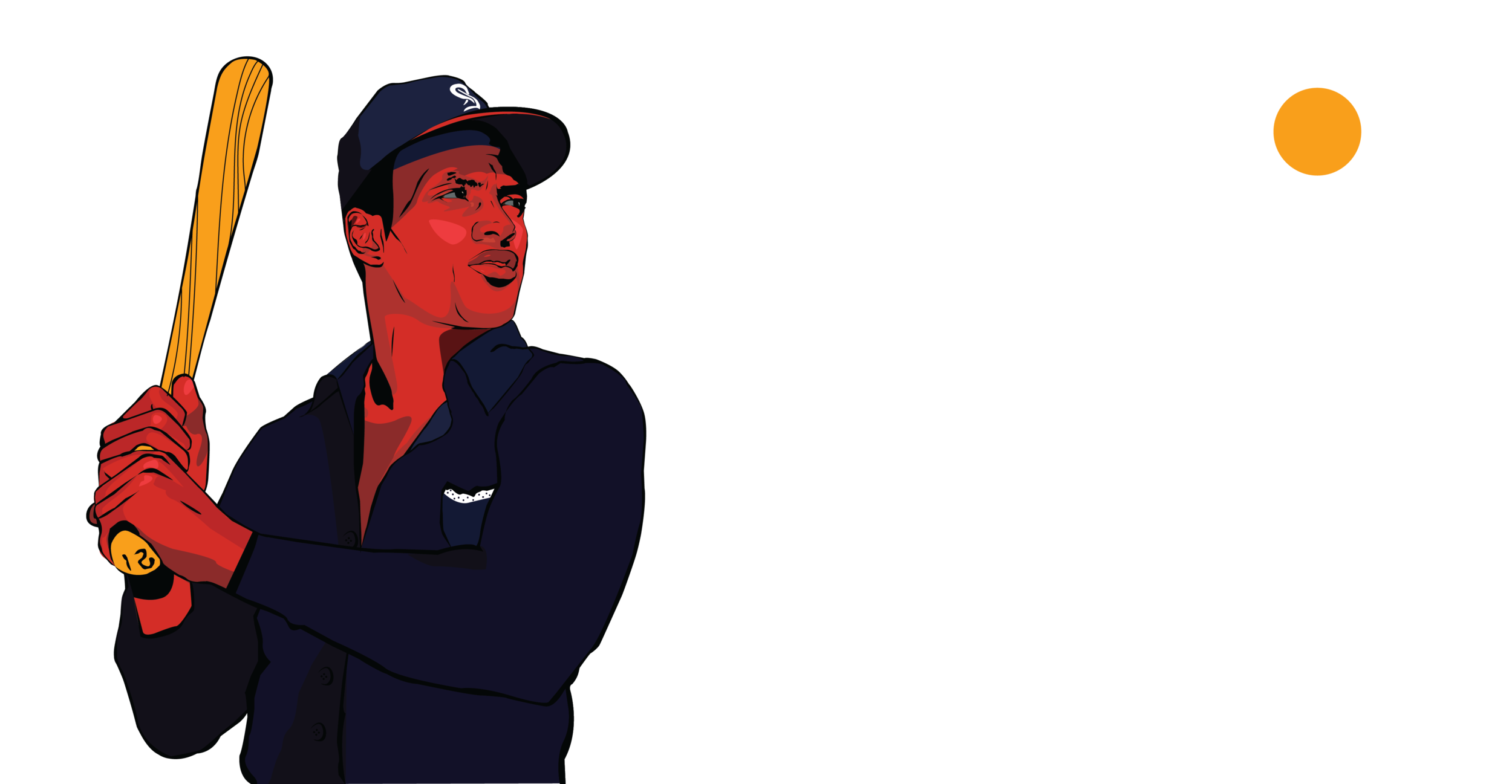
“3000”, 2018.
Wanting to validate my ideas, I made a second piece, drawing inspiration from my comfort blanket: Clemente. I wanted to use a more somber look just to get away from the “action” / “concentrated look” in order to understand if these colors were functional through other expressions. Also, I was in my groove and I wanted to push myself to make a second iteration.
“Roberto”, 2020.
By 2020, I was in Chicago.It had been almost a full year since I had touched a paint brush, and I was approached by a co-working space in Puerto Rico to do a “Santurce-sk”-inspired piece. I saw the space and decided to take a break from the windy Chicago winter, so I flew home to work on the project. The Piloto151 people were very open to what I wanted to do, and gave me access to the workspace after-hours so I could work freely all by myself, which made painting a lot easier.
Videography & framing.

“3000” process film, 2018.


Mural for Piloto 151: Santurce Suites. Santurce, Puerto Rico 2019.
