Receipt Hog
Receipt Hog is an app that has been around since 2013. The app gives user rewards in exchange for their physical and digital receipts. Physical receipts are scanned via the app and digital receipts are scanned from the user’s email.
The value of each receipt varies depending on where the purchase was made. This data is then analyzed with our b-to-b platform Insights, which creates reports based on the clients needs. When I joined the Numerator team in 2020, this was my first product handling all design aspects.
Context.
Millennial retention in the app was severely deficient.Users were dropping at an alarming rate. Realizing we didn’t fully understand the user due to lack of user personas, I set out to revamp the product from the ground up with the idea of finding new functionality and design through user research and validation.

My Role.
Ideate potential solutions based off of user interviews, create user flows, wireframes, hi-fi prototypes, app-version transition, and coordinated usability testing. I also worked with the PM and engineers to define a design system/assets library for the product.

Research Tools.
I defined a set of questions that would drive conversations towards potential user pain points and collaborated with our internal survey team to create our user sample. In defining these parameters, we decided it was a good idea to allocate resources for user testing, but more on that later.
The Sample.
We surveyed users in the app with a series of questions regarding their in-app experience. Out of the 1,000 surveyed, 60 left comments. We asked 5 of those to participate in user interviews conducted through Zoom.

Pain Points.
Initial user research showed that there were 3 major pain points for users: Lack of transparency, rewards for online shopping, and difference in receipt value. How were we using our user’s data? Who were we selling it to? Users wanted to know, and I believe they’re entitled to answers. Millennials aren’t shopping in stores, so why were we trying to push them towards brick-and-mortar locations? Why not reward them for the shopping they do?
What Are People Saying?
“I took a photo of a printed receipt and was told it was an error. This is the receipt that I got from Target, so why is it not being accepted?”
— Gina A, 28
“I can’t upload a screenshot of a receipt that was sent to my email. Is this secure? Can someone hack my information?”
— Sebastian H, 31
“Why is my physical purchase more valuable than my online purchase? Shouldn’t a receipt just be a receipt?”
— David P, 33
““I like the idea of getting paid for old receipts, but I just don’t shop in stores that much. Mostly Amazon. Could I get rewarded for my Amazon receipts? I literally buy something at least once a week.”
— Sarah B, 34
“The amount coins that I get for connecting my email is too low. I don’t understand how I don’t get rewarded more for something that has more information than my physical receipts.”
— Danielle A, 42
“I don’t feel comfortable sharing access to all of my email. Are you seeing all of it? I have sensitive information that I wouldn’t want people looking at.””
— Peter F. 26
Key Findings.

Transparency is key.
Users expressed feeling unwilling to provide access to their email because they didn’t know what it would be used for.

Online Shopping.
Millennials spend an average of $75 per purchase online and an average of $57 per in-store purchase. This generation makes up 58% of mobile shoppers and are 2.5 times more likely than the average shopper to be influenced by a mobile app.

Receipts ≠ e-receipts
Although the organization had rewarded users differently in the past, users were starting to question why we were doing this.
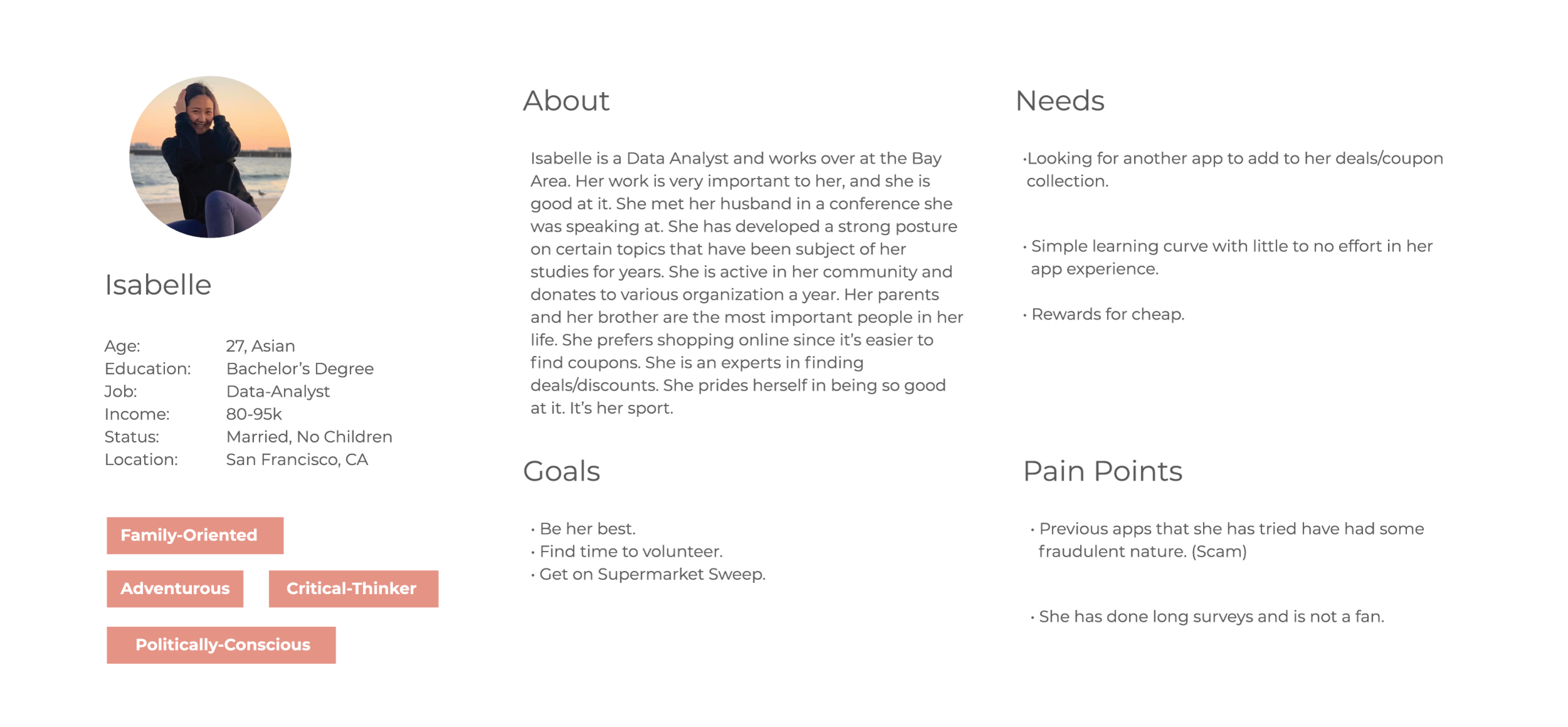
User Persona.
Our key findings really set us up with some good building blocks for our user personas. I like thinking of user personas as Frankenstein monsters that are built based on user interviews. Every single relevant detail gathered from the user interviews makes it to the user persona. This enables us to create multiple use cases for different personas rather than building individual personas for individual use cases. Maximizing interview resources for building a user consensus allows us to prioritize features based on what multiple personas value.
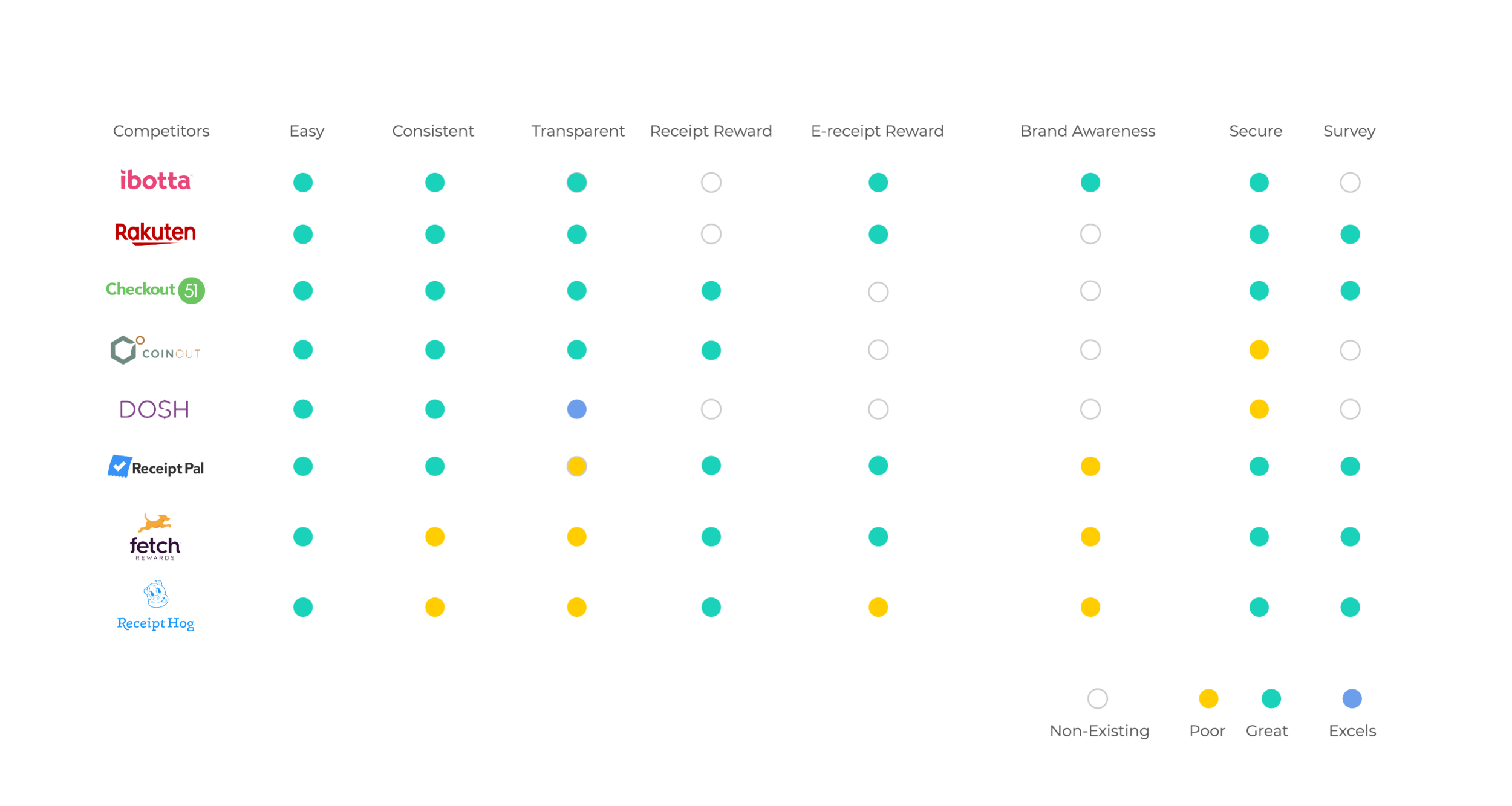
Competitive Study.
Before starting to sketch, I try to set myself up for success by understanding what the competition has done. There is a little bit of "keep your friends close, but your enemies closer”, but more importantly, it’s a time issue. By studying competitors, I can anchor ideas that I might get by comparing them to current industry standards. At times, the work lies not in reinventing the wheel, but in making it better.
Therefore, I created 8 categories in which to compare our product with our competitors. These categories had four possible answers: Non-existing, poor, great, excellent. The purpose of this was to create a benchmark to determine where we stand amongst our peers. Unfortunately, study results showed we weren’t too competitive, but this meant that we had an opportunity to build something better.

Hypothesis
After gathering the research, the following hypothesis was developed: “Treating an e-receipt like a physical receipt would incentivize user participation. Providing users with total control of what information they submit gives the desired user base a sense of security, transparency and trust in the product.“
Organization Perspective.
Naturally, there was initial pushback from the organization. The new strategy meant users would make more money which would bring user experience up, but would force stakeholders to incur in higher payouts for data. After the initial research was presented, accounting weighed in to highlight the pros and cons of this feature. Ultimately, the organization would lose more money if the projections drawn up by the data analyst/Product Manager were to become true. Millennials are currently the driving force of the data we wanted and needed in the app, therefore losing them and their data was not in the organization’s best interest.

Losing e-receipts data
This data represented almost 50% of out data gathering efforts. It was used to feed our main product, Numerator Insights. Without this data input, we would need to outsource our data, making it more expensive and less trustworthy.

Need for Millennials
Millennials spend an average of $75 per purchase online and an average of $57 per in-store purchase. This generation makes up 58% of mobile shoppers and are 2.5 times more likely than the average shopper to be influenced by a mobile app.
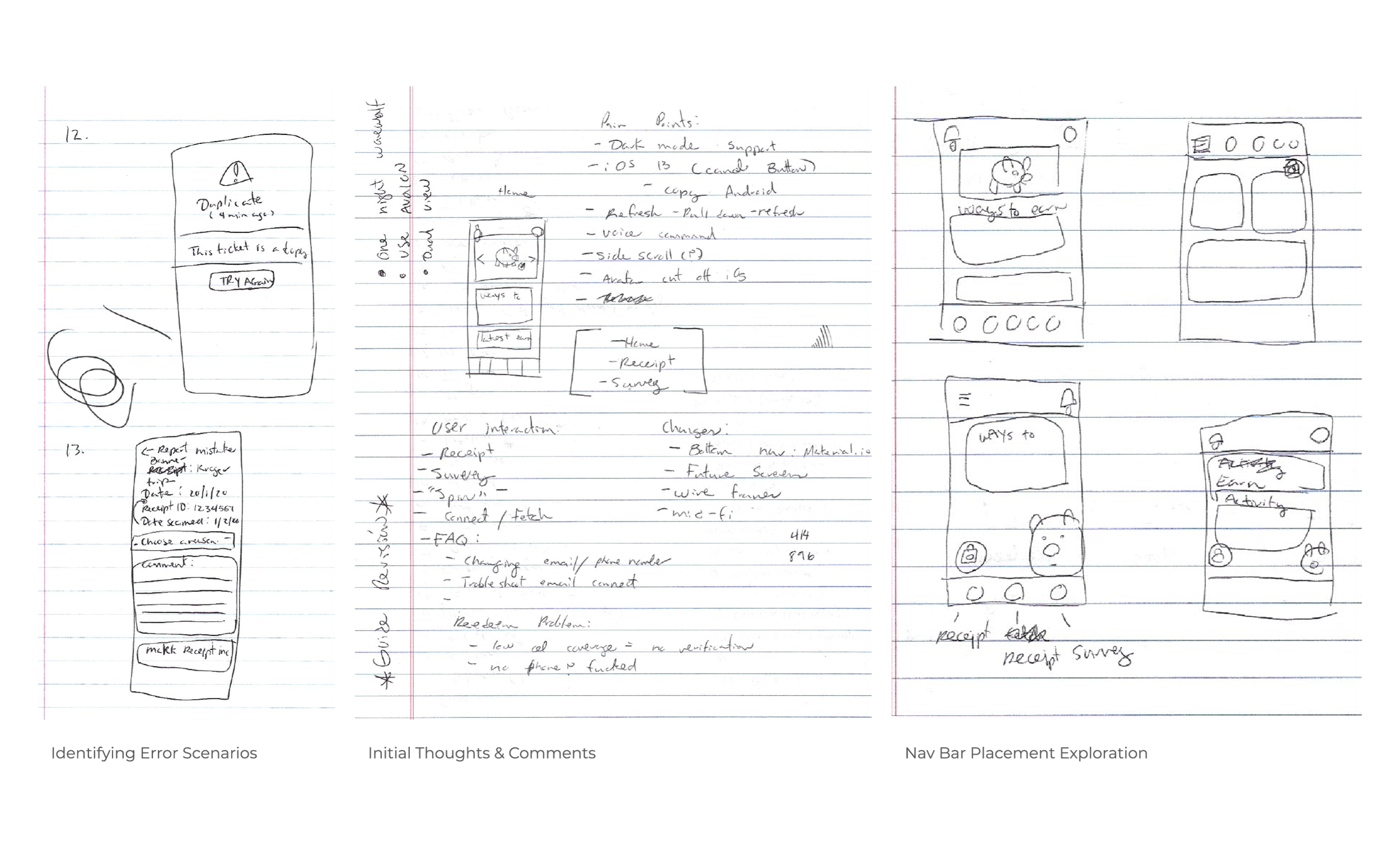
Initial Sketches.
I usually do some initial sketches paired with meetings in order to plan what the bulk of the work actually looks like. I consider it an important part of initial planning. These sketches are then used to guide discussions that drive the narrative of the design. In this large project, the more detailed the plan, the more aware we are of actionable deliverables. By expanding on concepts past the ideation phase, we can create timelines based off of the resource used to build. Although this is usually where a Product Manager and a Product Owner chime in, these meetings shed light on multiple infrastructure issues that need to be fixed before the build begins. Through user flows, we were able to identify where these problems were, allowing the engineering team to adjust priorities in order to set up the necessary infrastructure.
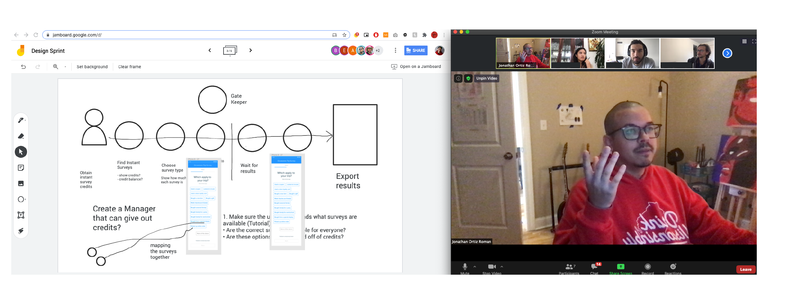
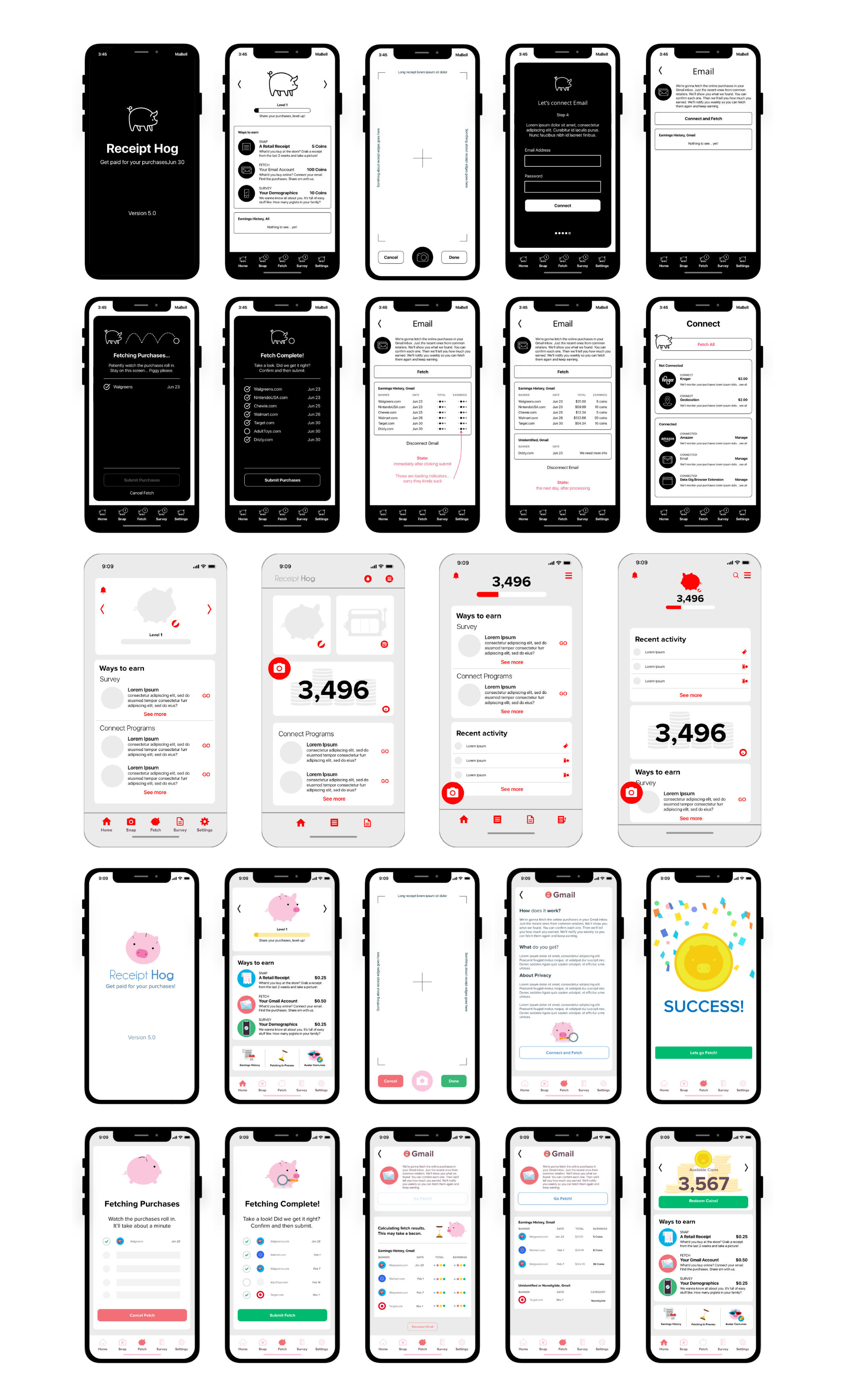
From Lo-Fi to Hi-Fi.
At this stage, we built lo-fi mockups with the mindset that the app would be redesigned aesthetically and functionally. I’m a big fan of balancing form and function. After I’ve found “balance” I present the design to the product manager and adjust to the needs of the roadmap.
Usability Test Feedback.
With the new e-receipts rewards feature leading the charge, the goal was to get users to associate the new design with the new feature. It looks better and it works better. Marketing got behind the idea and doubled down on the brand’s face lift. Within the organization, some suggested we outsource this to a marketing agency, but through a Hack Day presentation, I was able to highlight the redesign to higher-ups, who showed great interest in the new hog. We tested the designs with a small sample of users and received the following feedback:

Simpler Instructions.
Users requested an initial walkthrough “tutorial” that guides them from beginning to end. Initially, it was considered for version 2.0.1, but this feedback drove the point home: users needed more explanation on how to operate within the app.

Lack of Contrast.
Users expressed that there were moments where they felt like the app was “flat”. They found it difficult to distinguish between sections. After discussing this with the Product Manager, we decided to try something completely different with the next iteration.

Resisting Change.
A minority of the sample (1 out of 10) insisted that the app didn’t require changes. Some organization members leaned into the “if it ain’t broke, don’t fix it” analogy. Although the amount of people who shared in this assessment was minimal, we considered it worth mentioning.
Iterations.
With the new e-receipts rewards feature leading the charge, the goal was to get users to associate the new design with the new feature. It looks better and it works better. Throughout the process, we constantly pushed for that narrative. This wasn’t the app users were used to, but it was changing in a good way. We tested the iterated designs with a small sample of users and received the following feedback:

High Contrast.
Adding minor background changes enabled the tiles in the home screen to separate in order to provide clarity for the user. Some considered it to be “too millennial.” We took it as a sign that we were heading in the right direction.

Simpler Instructions.
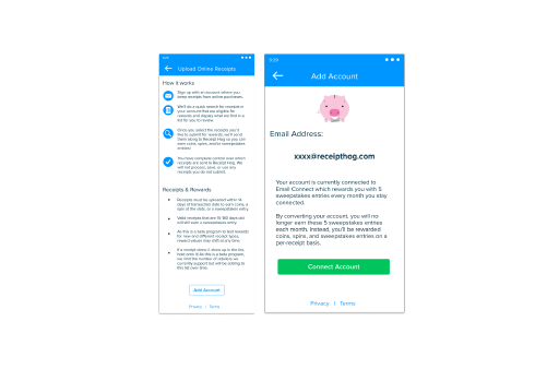
We added a simple 1-2-3 tutorial to the beginning of the flow to simplify and reduce user friction with the new email connect flow. These instructions provided the level of detail that the user needed to better understand what was happening. At the time, we hadn’t seen it because we had been too close to the product. The users let us know what they needed, and we listened.
Clearer Language.
In its first iteration, users were unclear on how this transition from a monthly reward to an individual reward per e-receipt benefitted them. Better language made for better understanding. Plain and simple: A user makes more money this way.
Usability Test.
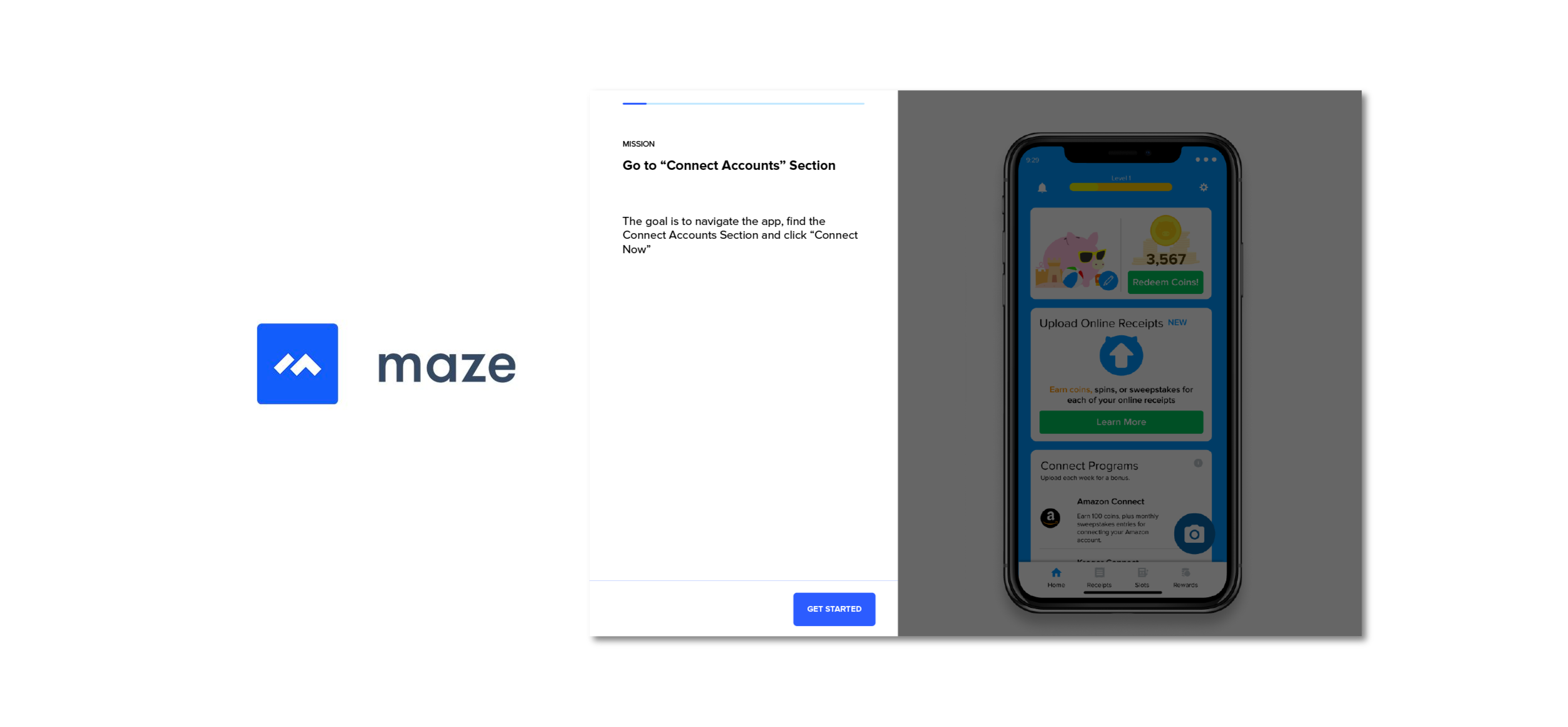
When testing, I am a fan of the “one-on-one” interaction with a user. Due to the pandemic, we switched to a fully online tool called Maze. This allowed us to diversify our user testing conditions and opened up the opportunity to test a higher number of users. It also allowed us to validate this method of virtual testing while seeing who had participated in order to create a new set of “Maze Testers”. We tested countless prototypes and concepts with the Maze design tool in order to validate the proposed theories..
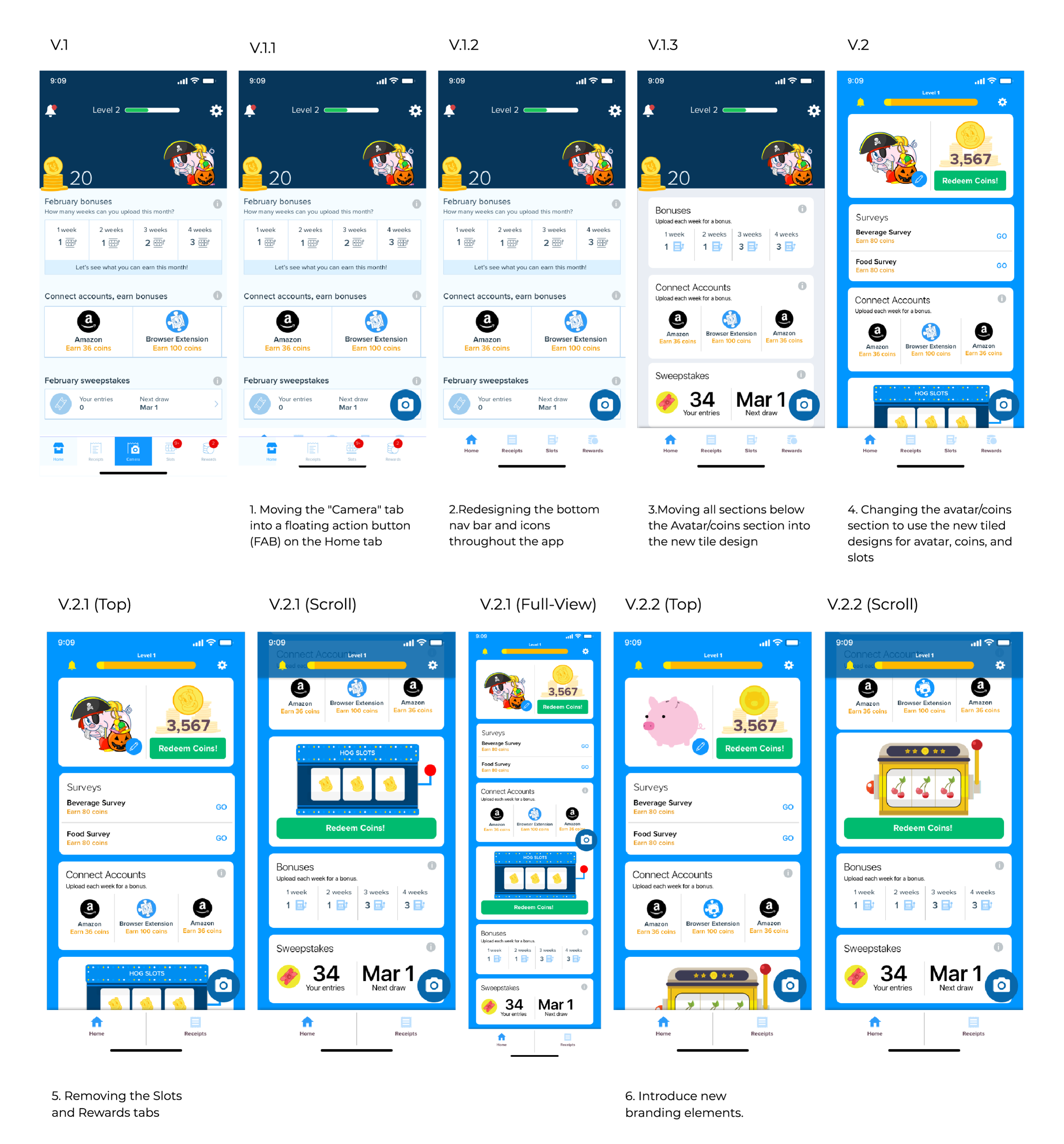
Version Iteration Breakdown & Design System.
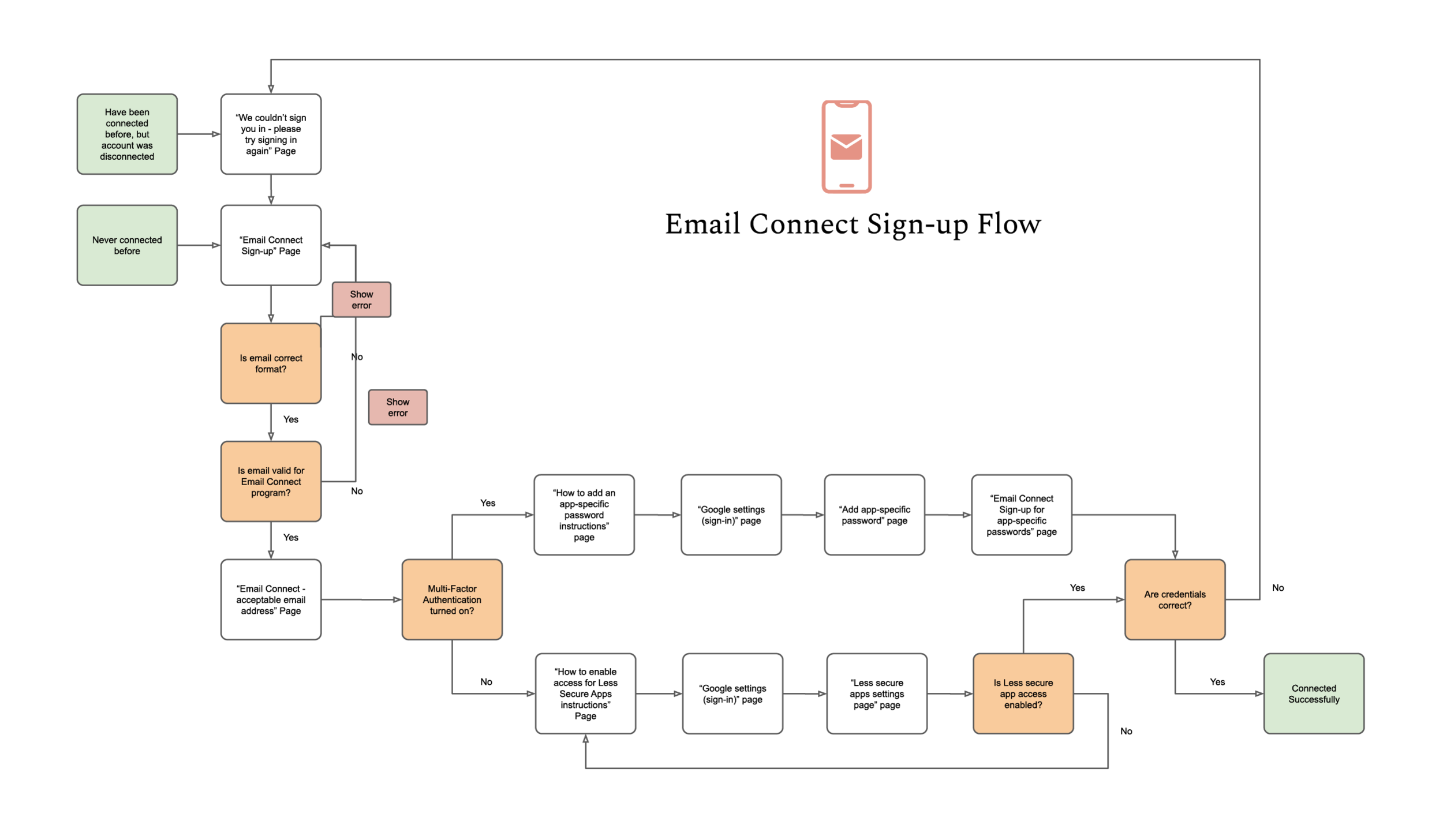
Although our initial mission was to integrate this new e-receipt feature, it slowly snowballed into a complete overhaul of the app. To avoid pushing the user too fast, a series of steps needed to be followed to assure that the change wasn’t too impactful early on. Gradual change in a product has been proven to be more well received by users, especially since we already had a minority who showed signs of resistance. Slow and steady wins the race. I was tasked with coordinating with the engineering lead to determine the app transition.
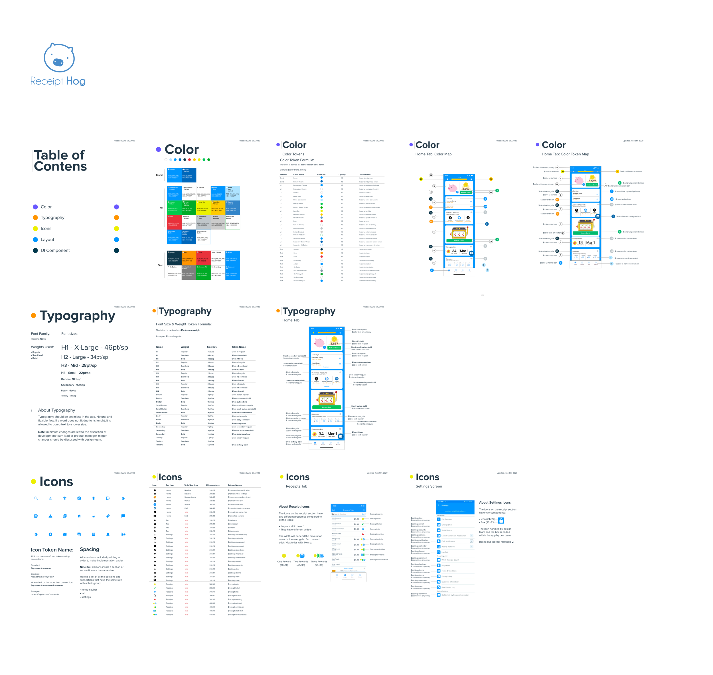
We mapped out even more user flows with real app screens, all while taking the time to build a design system for the app, since we didn’t have one. Colors, fonts, sizes, buttons, tokens, padding, you name it. Although tedious and strenuous, we were creating some building blocks for ourselves to make the product easier to work with from a backend perspective. Future us appreciated that we went through the grind to create our “set of legos,” setting ourselves up for success.
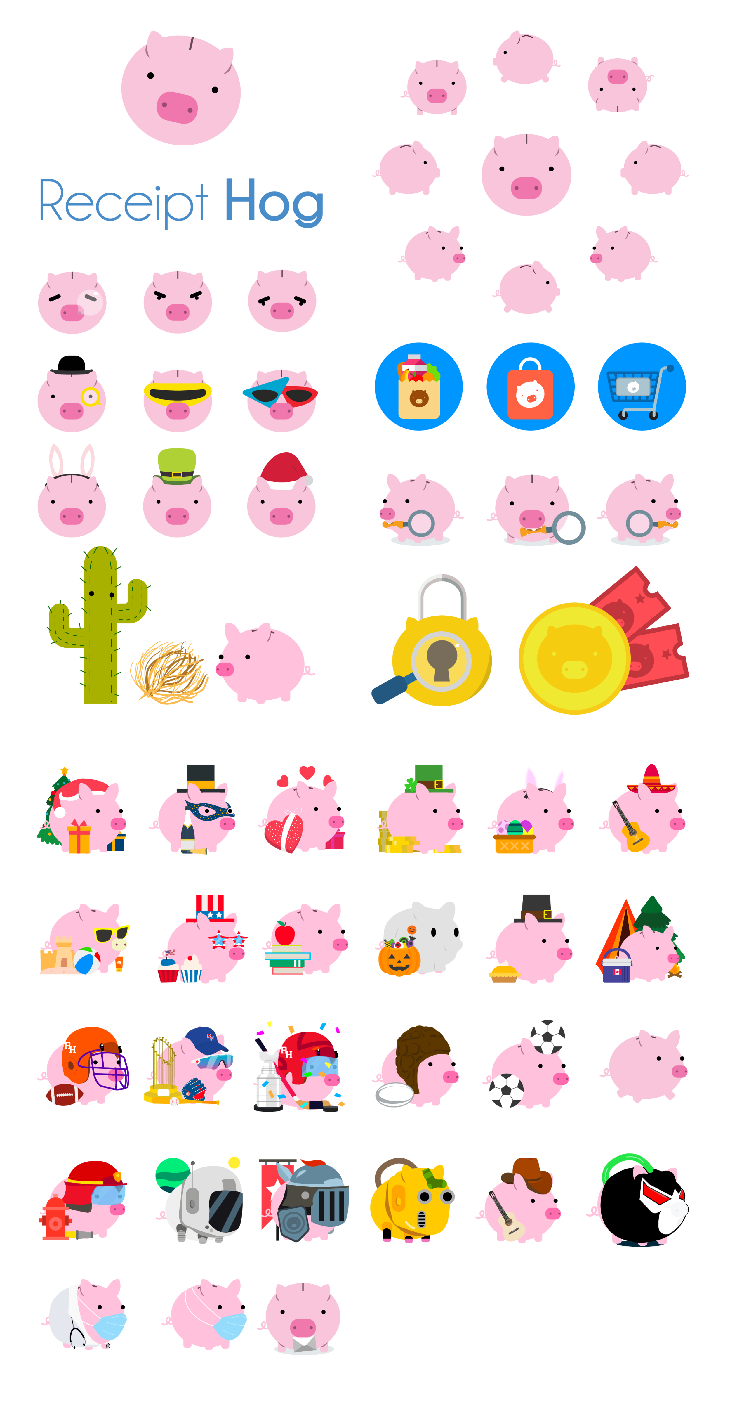
New Branding.
One of the reasons why this branding was such a “win” was because it wasn’t even meant to be built by me. Originally, as we set out to build the e-receipts rewards feature, the scope did not include a new brand. Marketing had already been in talks to outsource this to a third party. Being an illustrator who had dreamt of changing the “old hog” ever since joining the organization, I wasn’t too happy they were going the third-party route. This is why I participated in a Hack Day where I presented these designs as my “vision of the app moving forward,” It’s always nerve wracking to expose yourself to feedback and critique, but lucky for me, my proposal was well received.
The Results.
There is no greater feeling for an athlete than to see all of the hard work put into training pay off with a victory. For me, this year-long process has been the equivalent of that. Long nights, countless meetings and even more iterations that all led to this moment. After multiple user reviews and in-app user metrics tracking, we were able to determine that our work wasn’t in vain. We had succeeded.

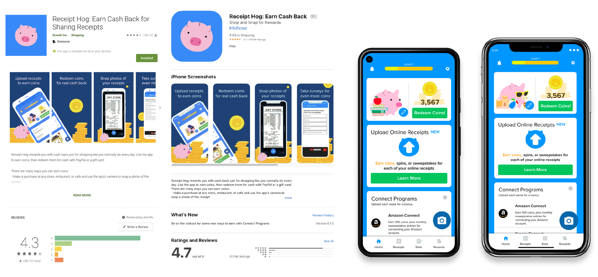
Positive Reception.
Our score on the Play Store and the App Store increased! Our Play Store score went from 4.2 to 4.3, and our App Store score went from 4.5 to 4.7, averaging 4.5 between both apps.

Demographic Rising!
Millennial use of the app has grown by 2%. A projection from the survey team shows that younger users are joining the app! Since the implementation of new messaging and new brand in the app store, millennial users have joined the #BaconNation.

Less Customer Service.
Brand unification and simplifying messaging has helped decreased Q&A team workload related to Receipt Hog by 9%.

“The app is cute, the writers are funny! this is a great idea and fun while being productive and worthwhile at the same time. Yay lepigchauns!”
— Amber A., 27
Some Lessons
Throughout this process I learned patience most of all. Working in a corporate organization means a lot of bureaucracy and red tape. Meticulous, over-processed situations made me feel slow. But I learned that at times, going with the flow is the only thing you can do. I made sure that the work and effort put in showcased the attention to detail, the 100+ hours in surveys, the user testing, and above all, the user-centric design. This led us to key take-aways about our users and our product.

Good UX = Happy Users.
Our users are very vocal and giving them a space to talk captured qualitative and quantitative data better than a survey could ever provide. Giving them a stage where they can voice their concerns, opinions, pain points, etc., is what got us here. If providing them with a good experience was not in our mindset, we might not have users, and without users, we don’t have a product.

Opportunity for growth.
Users crave better UX and this project validated it. This is just the beginning of what the brand and the product could become. Believing in user feedback and using it as a tool to push new narratives that highlight the users’ struggles will only give us the opportunity to grow our user base and our product.
The Next Steps.
Let’s talk about making the application appealing, making the product better, but more importantly, let's make a product that’s accessible to all. Doing the bare minimum is not the way to attract new users. We must work to simplify our designs because simple designs areis great designs. The simpler something is, the more people can use it. Dark mode, low visibility filters, text reading, colorblind mode, I would love for all of these to happen.

Inclusive Representation.
Breaking the mold is always hard to do, especially when creating something that works. However, we must not limit our work so that just a certain population has access to it. Scalable Empathy is synonymous with Inclusive Design. The goal is to design for all, not excluding some. That is why accessibility and representation are next on my list.

Donating Rewards.
Early research has shown that some younger users are more willing to participate in providing access to their purchase information if said reward could go to a cause of their choice. It is their reward, so why not partner up with them in order to make it easier for them to donate?
Reflections.
Excitement over a product’s growth can stimulate an organization. Not just the people that designed and built it, but the whole organization. It shows confidence and trust in innovation. It’s betting on trying new things in order to gain new clients. In seeing the importance of user research, we made a conscious decision to implement it in all of our products. It really makes you feel like a wizard.
